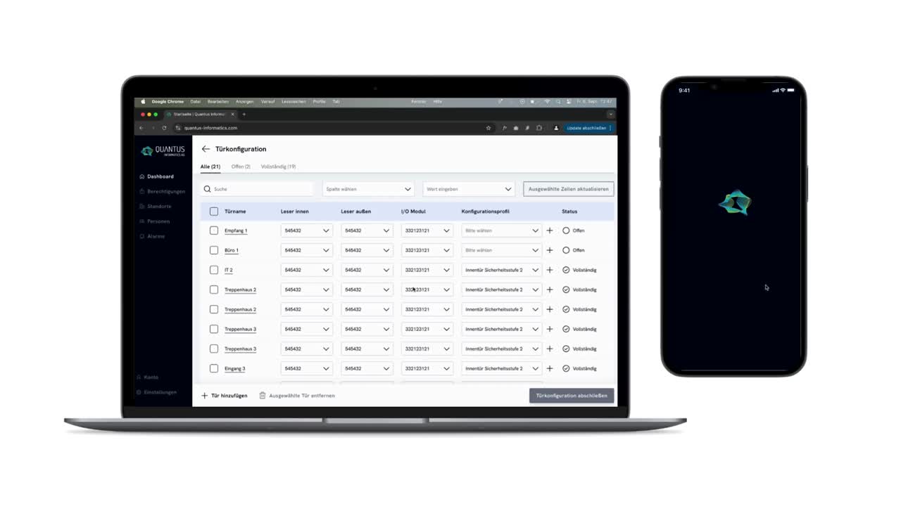
Client

Quantus Informatics AG

Creating a Visual Design Route and Design System for an IOT based access control platform and app

Branding

UI Design

Design Systems

In cooperation with Melissa Hanke

June - August 2023

01 / 06

The opportunity

Quantus Informatics AG approached us with the challenge of developing a cohesive visual design for their IoT-based access control platform and mobile app. The project involved designing both the user interface for the desktop platform, used to manage access to the IoT devices, and the app, which facilitates the installation of these devices. Our mission was to create a design that communicated the core values of innovation, security, and flexibility while maintaining a clean, futuristic, and user-friendly aesthetic. An additional challenge was designing a visual solution that would work seamlessly with the platform’s heavy reliance on data tables.

02 / 06

Branding Workshop

The project began with a branding workshop where we collaborated closely with the client to clarify foundational elements such as the value proposition, target audiences, and competitors as well as their brand values and design goals. Through a series of exercises, we identified the key attributes that would define the visual identity: innovation, security, and flexibility. These insights became the foundation for the design exploration that followed. The workshop set the stage for ensuring that the design not only met functional needs but also aligned with Quantus’s brand vision.

03 / 06

Visual Exploration

With the insights from the branding workshop in hand, we began exploring different visual directions that could express the brand’s values. The goal was to balance a futuristic, secure, yet simple design language that would be intuitive for users. I presented three distinct design directions, each with unique interpretations of the brand’s aesthetic. These directions were assessed in terms of usability, scalability, and their ability to work effectively with data tables, a crucial element of the platform

04 / 06

Design Vision

After discussions with the client, we finalized the design vision, which included detailed decisions on typography, color palettes, and illustration styles. The design aimed to be clean, minimalistic, and forward-thinking while ensuring ease of use. I combined all these elements into key vision screens that demonstrated how the design would come together across various interfaces. This holistic vision captured the desired balance of innovation and simplicity, setting the tone for the detailed design work that followed.

05 / 06

Design System

Building on the approved design vision, I created a comprehensive design system that included all the necessary components for both the desktop platform and the mobile app. This system featured guidelines for fonts, colors, button styles, and tables, ensuring consistency across all touchpoints. The design system not only streamlined the development process but also provided a scalable framework that the client could continue to use as the platform evolved.

06 / 06

The Outcome

The final deliverables were two comprehensive prototypes: one for the desktop platform and one for the mobile app. These prototypes embodied the design vision, incorporating the key elements from the branding workshop and visual exploration phases. The clean, flexible, and secure design met the client’s goals, and the accompanying design system provided a solid foundation for future development. These prototypes are now serving as the basis for the platform’s ongoing implementation, ensuring a cohesive and well-structured user experience.

Reference

“Working with Sandra was a lot of fun. She was able to respond very well to us and our problems and contributed a great deal to understanding the problem, finding a solution and developing the product. Thanks to her creative approach, she managed to ensure that our values were reflected in our product, always with a focus on the user.”

Daniela Roth

CEO @Quantus Informatics AG

01

What surprised me

I was surprised by how integral the tables became to the overall design. While I anticipated them being an important part of the platform, The level of detail and flexibility required to make the tables both functional and visually aligned with the brand was unexpected but ultimately rewarding to solve.

02

What challenged me

One of the most complex aspects of the project was designing tables that could accommodate varying types and sizes of data while remaining flexible and visually consistent. The challenge was to ensure the components adapted without compromising usability.

03

What I would do different

During the branding workshop, some participants struggled with defining abstract concepts like brand values and design attributes. For future projects, I would adjust my approach, I’d keep the task of defining design attributes as part of my internal design process rather than asking clients to articulate something too abstract.

04

What I am proud of

I’m particularly proud of the comprehensive and flexible design that seamlessly extends across both the mobile app and desktop platform. Despite the differences in the two interfaces and products, the design maintains a cohesive brand identity throughout.

Takeaways

Here's what I learned.

Next

//

Next

//

Next

//

Next

Telekom AG | IOT

UX Research

UX Design

User Testing

Innovating Pet Safety by Crafting a Dog Tracking App based on IOT

PrepLounge GmbH | Consulting

Branding

Design Systems

UX Design

Branding and Optimizing UX of a Consulting Community Platform

Next

//

Next

//

Next

//

Next

//

Next

//

Next

//

Next

Next

//

Next

//

Next

//