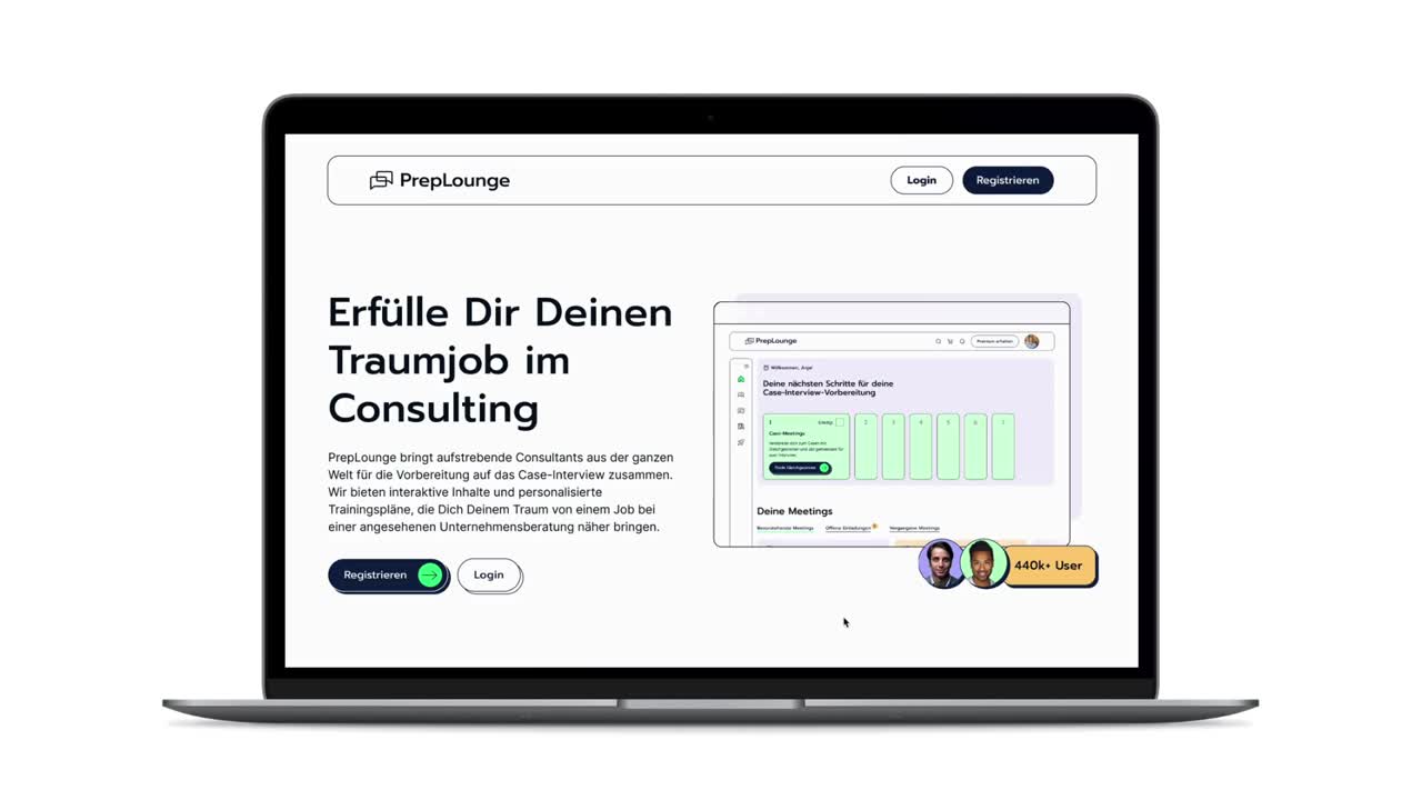
Client

Deutsche Telekom AG

Redesigning a streaming platform to ensure a seamless cross device user experience

UX Design

User Testing

Web

June - August 2023

01 / 07

The opportunity

PrepLounge is a platform supporting consulting candidates in their interview processes for leading consulting firms. Their international community consits of over 450.000+ canditates and over 700 coaches, which makes PrepLounge one of the leading consulting community platforms. Desprite their success, PrepLounge and had an outdated website with several UX issues due to rapid growth and inconsistent design. I was commissioned to rebrand the platform and redesign key product areas. This project aimed to create a cohesive, fun, and user-friendly experience for PrepLounge’s diverse user base.

02 / 07

Branding Workshop

What should the brand transport?

We kicked of the rebranding process with a branding workshop to establish foundational elements such as the value proposition, target audiences, and competitors. During this workshop, we defined brand values and translated them into design attributes. We then collaboratively gathered inspiration for the design vision based on these attributes.

03 / 07

Visual Exploration

With the branding workshop's results in hand, I embarked on a visual design exploration starting with the landing page. I tested various combinations of colors, fonts, styles, and illustration styles for both mobile and desktop screens. After several feedback loops, we finalized a design vision for the new branding.

04 / 07

Design Vision

After some iterations of the different design directions, we agreed on a design vision for PrepLounge’s future branding – a fun yet professional design that plays with the contrast of colorful areas and rigid contour lines. The grid look serves as a basis for a modular design that perfectly aligns with the various content tiles the product includes. Rounded corners, playful illustrations, and subtle use of the overlay effect from the logo in various elements add an extra touch to the design.

05 / 07

Design System

After finalising a design vision and to apply this branding to the keyscreens, we finished the project with the establishment of a comprehensive design system within Figma . As a fundamental system, I set up a colour palette, a grid system, text styles and icons. Based on these, I setup multiple components such as basic interaction elements like buttons, tags and form fields – but also more comprehensive components like profile cards for the listing page.

06 / 07

Conceptual Optimization

Using the design system as a foundation, I conceptually redesigned other areas of the platform to optimize the user experience. This included the home screen and coach profile, ensuring these areas were user-friendly and aligned with the new brand identity.

07 / 07

The Outcome

The project resulted in a new branding for PrepLounge, complete with an extensive design system. This system is now being gradually rolled out across the platform, ensuring a consistent and branded user experience. Over time, additional areas will be iteratively adjusted and optimized, leading to a holistic improvement in the platform’s UX.

Reference

“Sandra supported us in the rebranding of PrepLounge, and from conception to execution, the collaboration was very enjoyable. With her attention to detail and ability to simplify complex topics, Sandra helped us immensely and took us a big step forward. We highly recommend working with her!”

Valentine Alexi

CEO @PrepLounge GmbH

01

What surprised me

I was pleasantly surprised by the depth of insights and ideas that emerged from the user journey workshops. The richness of understanding about the target groups, coupled with the competitors' landscape, laid a robust foundation for our project.

02

What challenged me

Navigating through the uncharted waters of an early-stage product design phase while simultaneously having the liberty to explore various design avenues was both exhilarating and demanding. Balancing innovation and making sure we reach the project goal within our given capacities was  a particular challenge.

03

What I would do different

In retrospect, I would focus on exploring a wider spectrum of design variations at an earlier stage. This would have helped us converge on the design direction more swiftly, while still harnessing the freedom to innovate.

04

What I am proud of

I take pride in the project's comprehensive scope, starting from orchestrating workshops that shaped our understanding, to developing concepts and finally designs that resonated with the client and users alike. Witnessing very positive client feedback affirmed the success of this project.

Takeaways

Here's what I learned.

Next

//

Next

//

Next

//

Next

Wilma

//

Industry: Coaching

Branding

UX Design

Design Systems

Crafting a Visual Identity for a Female Business Coaching Platform Startup

Telekom AG

//

Industry: IOT

UX Research

UX Design

User Testing

Innovating Pet Safety by Crafting a Dog Tracking App based on IOT

Next

//

Next

//

Next

//